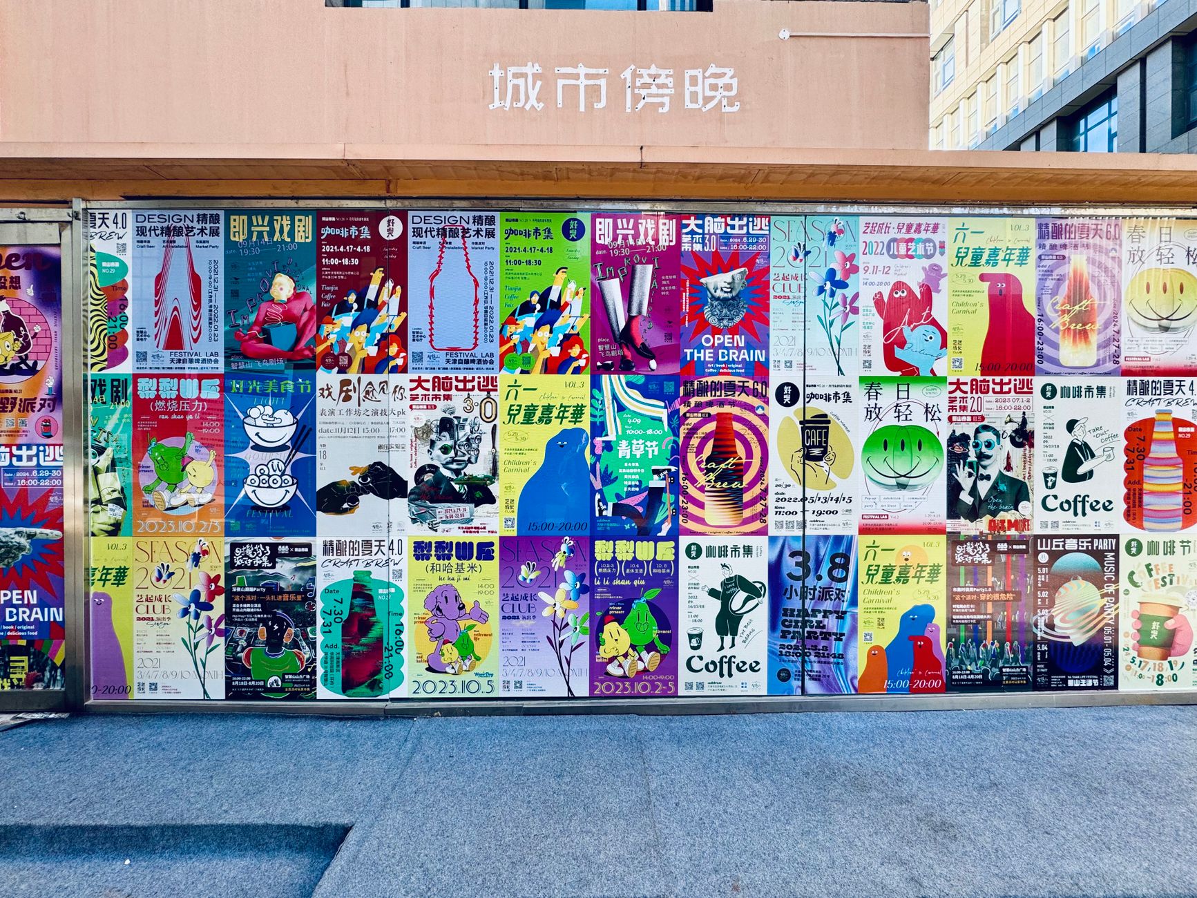
Eleven posters for a season of plays
One grid, one typeface and a colour for each play, so the season reads as a set on a wall and each poster stands alone.
Open the pieceInês Carvalho, graphic designer
Fourteen years of print and identity work for theatres, presses and small makers. Move across the page to look through it.

Six pieces. Turn them over.
Posters, a quarterly, five jars, a mark, twelve covers and a window.
One grid, one typeface and a colour for each play, so the season reads as a set on a wall and each poster stands alone.
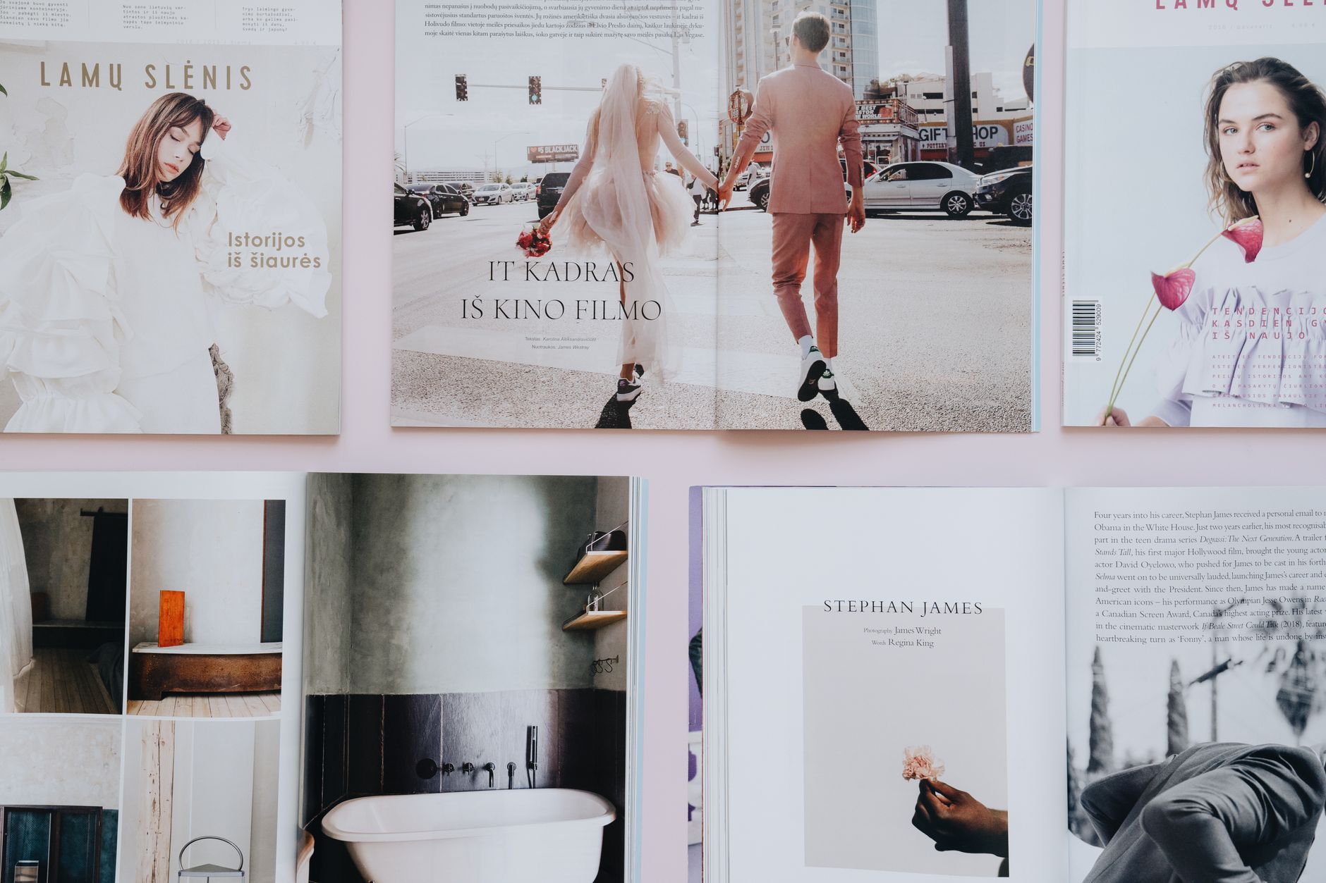
Open the pieceA new grid, two typefaces and a rule: the photographs decide the page. The magazine lost its sidebars and gained its readers.
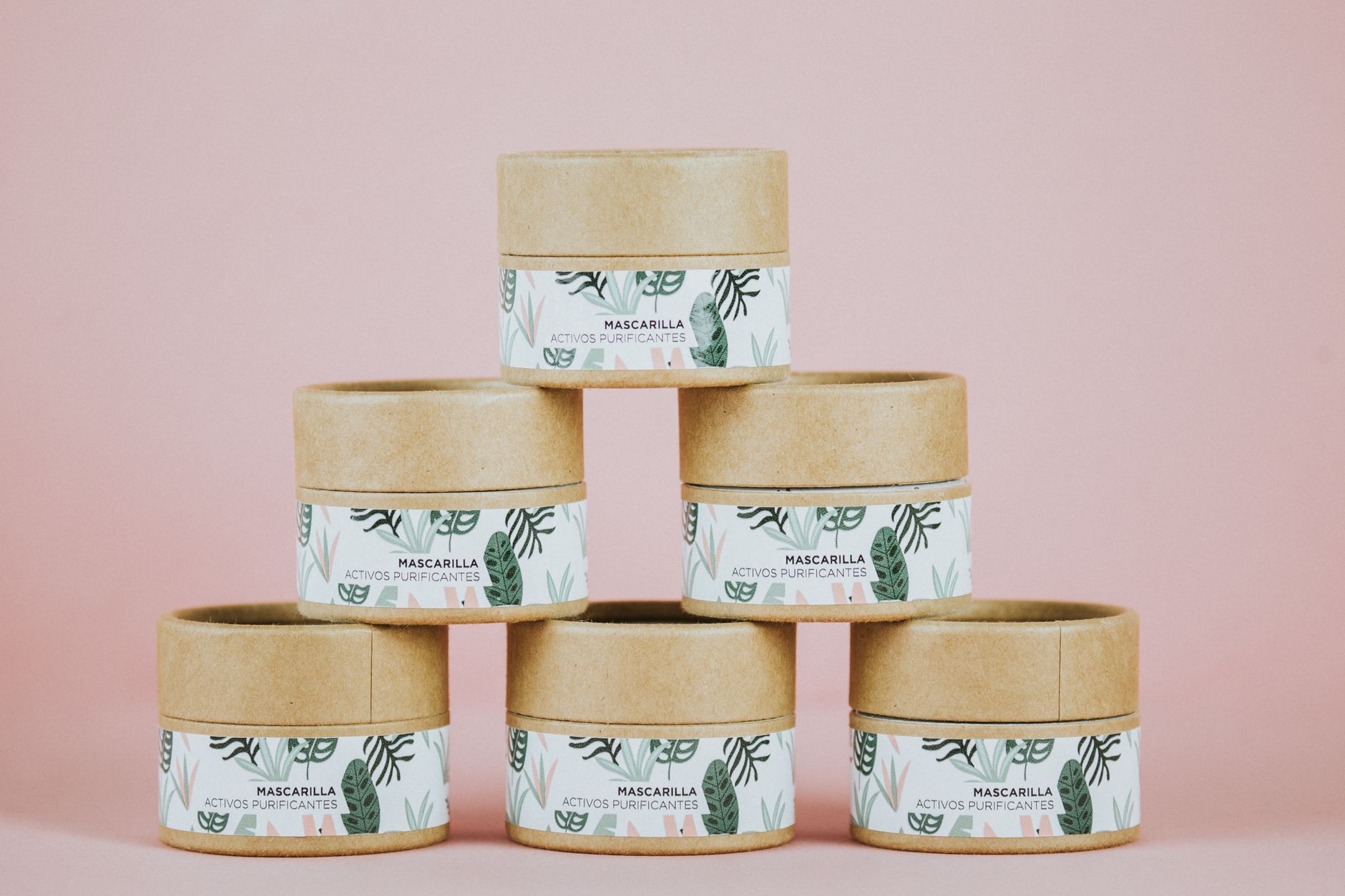
Open the pieceFive jars that read as a family on a shelf and as one object in the hand. Paper labels, two inks, no plastic sleeve.
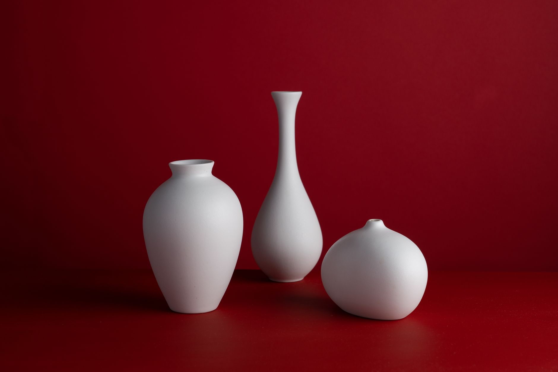
Open the pieceA wordmark drawn with the same brush the studio glazes with, and a system that lives on kraft tags and a kiln-side chalkboard.
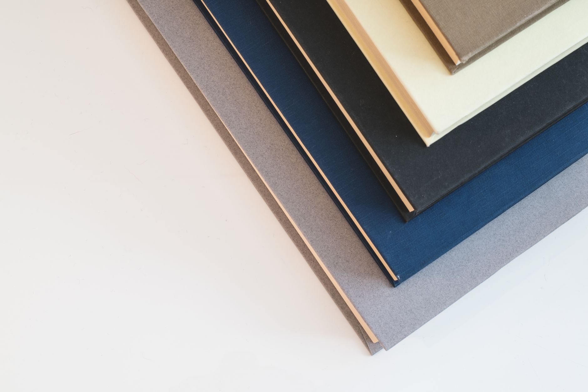
Open the pieceA series that looks like a series: one type size, one position, a colour per author. Readers collect them by the spine.
Open the pieceFour hundred folded sheets in the colours of the autumn collection, lit from below. Built in the shop, over a weekend.
Open the pieceOne fee. One direction. Finished when it is finished, not when the deck is.
Taking commissions from January 2027
Everything, in order.
Make something that looks the way it is.
Write a few sentences about what you make. One fee, one direction, and a date.